jueves, 12 de junio de 2014

Waterman's pens from the seventies: illustrated, chronological listing.

REVISED on June 16, 2014.

While the early production of this famous manufacturer is fairly well known, I have observed, when looking for information on the network, a lot of ignorance with regard to the French models and, in particular, concerning those introduced during the seventies. Such a situation has led me to prepare an illustrated, chronological listing of these latter. That listing is essentially based on advertising, being everything but comprehensive; in fact, there exist not a few models less known to the mass of Waterman collectors, mainly school pens, not even mentioned. Anyway, it shows the most relevant models of the whole decade.

Dates of introduction refer, unless otherwise indicated, to the oldest advertisements of the models under consideration I have been able to find and are, therefore, approximate. Nevertheless, one cannot expect errors larger than a year. Writing modes available are also included as well as related design patents (with application date and designer) whenever they exist.

I hope you find this listing helpful for your collecting interests or, at least, educational.


1971 Concorde (fountain pen and ballpoint pen) --- (reviewed on this blog)

            US D 212,866 (fountain pen) (Jan. 23, 1967) (Roger Perraud)


Concorde ad (1971)


1971 Graduate (fountain pen, felt-tip pen) [1]

            US D 233,631 (marking pen) (Dec. 28, 1972) (Eugène Defores)

            Oldest ad: 1973. (see Waterman's ads showing fountain pen and felt-tip pen ranges below)

            There existed a matching version of the popular Flair ballpoint pen.


1973 Waterman's range of fountain pens:
Torsade, Man 21, CF, Graduate and Concorde


            The Graduate model underwent several changes during its long life, concerning particularly
            the pen's clip and section. In 1973 ads appear the original versions of both pens.
            The 1975 ad  shown below displays a fountain pen of the second generation.

            It is really strange to me that Waterman did not protect the design of the fountain pen,
            which proved to be extremely successful. So I have not been able to figure, up to now,
            who its designer was.


1972 Man 21 (fountain pen, ballpoint pen) --- [see Waterman Gentleman, old-style (below)]


Man (later Man 21) ad (1972)


Man (later Man 21) ad (1973)


            Created by the moderately famous French designer Alain Carré.

            Both designs (Man 21 and old-style Gentleman) shared the pen casing,
            the only difference being the section-nib-feed ensemble, absolutely interchangeable
            at any rate.

            Called “Man” at first, it was aimed at being the successor to the mid-sixties Man model
            as top-of-the-line man’s fountain pen (see article on this blog). On this occasion,
            a ballpoint pen was also developed.

            The Man 21 fountain pen was equipped with the faceted nib of the Concorde,
            set on a similar but larger section. On the contrary, the old-style Gentleman exhibited
            the more conventional SUPER 6 open nib, a heritage of the former Man model.

            For some reason, Waterman did not introduce the Gentleman until two years later.

            Alain Carré also designed the (new) logo that Waterman used during this decade.


1972 Torsade (fountain pen, felt-tip pen, ballpoint pen, mechanical pencil)

            US D 229,636 (casing for pen) (May 25, 1971) (Eugène Defores)
            US D 228,690 (marking pen) (Aug. 18, 1971) (Francine Gomez)
            US D 229,357 (ballpoint pen) (Nov. 9, 1971) (Eugène Defores)


Torsade ad (1972)


            A refined version of the Graduate line of writing instruments, whose cap and barrel exhibited
            longitudinal stripes that twisted in spirals around the pen axis.

            As with the Waterman Graduate, different versions appeared as time went by.


1972 – Facette (fountain pen, felt-tip pen, ballpoint pen, mechanical pencil) *

            Oldest ad: 1977.


Facette ad (1977)


            Another sequel of the Graduate model, this time with straight facets instead of twisted ones.

            There existed different versions, which included, among other features,
            open and hooded nibs (as seen on the network).

        *  Since I have seen Facette pens with the Graduate's old-style clip,
            I have assumed that this model should be put into market simultaneously with the Torsade.
            The new clip was introduced in 1973. (see Waterman Flair)


1973 Watermina and Waterminum (felt-tip pen, fountain pen, ballpoint pen)

            US D 240,032 (marking pen) (June 19, 1974) (Francine Gomez).
            US D 244,529 (fountain pen) (Mar. 21, 1975) (Francine Gomez).


1973 Waterman's range of felt-tip pens:
Graduate, Torsade, Watermina and Waterminum


Watermina ad (1973)


            Initially, this was the most luxurious line of felt-tip pens ever developed by Waterman.
            At first there existed two different versions: a thin, clipless one called Watermina,
            aimed at women, and a larger man's one marketed under the name Waterminum.
            Later on, both of them were equally known as Watermina.

            The fountain pen was designed a year later and also advertised as Watermina.
            Nevertheless, it appears as Waterminum (larger felp-tip's matching fountain pen)
            in salesman's brochures.

            A matching ballpoint was introduced too.


1973 - Flair (ballpoint pen, mechanical pencil)

           US D 240,524 (June 19, 1974) (Alain Carré)


1973 Waterman's range of ballpoint pens:
Torsade, Man 21, CF, Flair and Concorde


Graduate ad (1975)


            Graduate's matching version of this long-lived model. Top actuated retracting mechanism.


1974 Gentleman, old-style (fountain pen, ballpoint pen)

            US D 234,471 (fountain pen) (Aug. 18, 1971) (Alain Carré)


Waterman's "state of the art" in pen manufacturing (1974)
From left to right: CF ballpoint pen, Watermina felt-tip pen, Gentleman fountain pen


Waterman Gentleman ad (1975)


            With the same casing as the Man 21 fountain pen, the Gentleman had a SUPER 6 open nib
            instead of the Concorde's one as well as a rounded section.

            This model has nothing to do with the more popular one introduced in 1982,
            which displayed an entirely new design and construction.


1976 Directeur General (fountain pen, ballpoint pen, felt-tip pen)

            US D 245,852 (ballpoint pen) (Oct. 9, 1975) (Alain Carré)
            US D 246,723 (fountain pen) (Oct. 9, 1975) (Alain Carré)


Directeur General ad (1976)


            Basically a re-design of the so popular CF with a lacquered, long articulated clip
            which embraced the top of the cap in a way similar to that of
            the Man 21 and old-style Gentleman models. The Directeur General also displayed
            matching lacquered stripes on both barrel and section.

            A second, rather different version with fluted body and no insets was introduced
            at some point later.


1978 Goutte (fountain pen, ballpoint pen) [2]

            USD 253,660 (ballpoint pen) (Apr. 7, 1977) (Alain Carré)
            USD 254,315 (casing for pen) (Apr. 7, 1977) (Alain Carré)

            Oldest ad: 1979.


Goutte ad (1979)


            A new line of slim writing instruments characterized by its rounded forms.
            This concept had influence over other contemporary and future models.
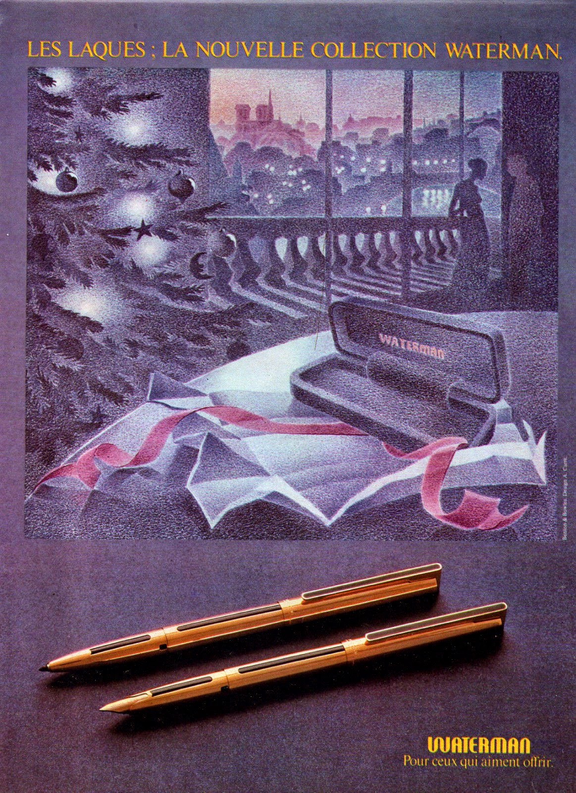


1979 Master (fountain pen, ballpoint pen, felt-tip pen, mechanical pencil) [1]

            Oldest ad: 1981.


Waterman ad promoting the Master (left) and Laureat (right) models (1981)


            Essentially, a lacquered version of the Graduate model with gold-plated trim aimed
            at the mid-range market.

            Equipped with a 18K gold nib at first, later offered with a gold-plated one.


1980 - Slim Goutte (fountain pen, ballpoint pen) [3]

            US D 261,009 (fountain pen) (Sep. 11, 1979) (Francine Gomez)

            Luxirious version of the Goette model aimed at women. Shorter and slimmer than
            its predecessor, it displayed a semi-precious stone in cabochon cut at the end of the clip
            as well as a metal-plated section.


1980 – Pierre Dure (fountain pen, ballpoint pen) [1]

            US D 259,642 (ballpoint pen) (Jun. 5, 1979) (Francine Gomez)
            US D 260,101 (fountain pen) (Jun. 5, 1979) (Francine Gomez)

            A strange hybrid between the Directeur General and Goutte lines, combining straight
            (essentialy the clip of the first one) and rounded forms. It displayed a semi-precious stone
            in cabochon cut set on top of the cap and, in the case of the fountain pen,
            another one on the barrel's bottom. Unlike the Directeur General pens,
            the clip is not articulated, being of the washer type. The pen's section is metal-plated.


1982 Gentleman, new-style (fountain pen, ballpoint pen, felt-tip pen, mechanical pencil) [1]

            Oldest ad: 1987.


Gentleman ad (1988)


            This is the model most of us know under the name Gentleman.
            
            It was an absolutely new design, not connected with the old-style model. The pen was
            entirely made of lacquered heavy brass, displaying a tubular shape. Its distinctive clip,
            of the washer type, was a re-design of Harley Earl's CF one; it became
            one of the Waterman's hallmarks. This new-style Gentleman meant for Waterman
            the return of the flat-top era. It could be considered as the precursor of the Man 100 model.


1983 Man 100 (fountain pen, ballpoint pen, felt-tip pen, mechanical pencil) [4]

            US D 280,420 (ballpoint pen) (Apr. 13, 1983) (Jean-Paul G. L. Verhaegue)
            US D 280,737 (fountain pen) (Apr. 13, 1983) (Jean-Paul G. L. Verhaegue)

            Oldest ad: 1985.


Man 100 ad (1985)


            Waterman's top-of-the-line model for almost a decade and, for many pen lovers,
            one of the best fountain pens ever made. But that's another story!


[1]   For the fountain pen dating, see, for instance, this "press release".

[2]   For dating this line of writing instruments, see, for instance, these sites: 1, 2.

[3]   Dating: personal estimation.

[4]   Universally accepted dating.


lunes, 3 de marzo de 2014

Waterman Concorde: a further step into the future!


"The Man and CF models have no competitors at all. The new Concorde won't have competitors during a long time. When there is no competition, one should invent!"
(from Waterman's ads, 1971)


Concorde! The first thing this name brings back to memory is the Aérospatiale - British Aircraft Corporation Concorde, that universally known supersonic airliner which, for more than a quarter of a century, carried passengers at more than twice the speed of ordinary commercial aircrafts. A hymn to international collaboration, a milestone of aviation. But a failure from an economic point of view. I wonder whether writing instrument and airplane may be somehow connected or not.


Aérospatiale - British Aircraft Corporation Concorde
(photograph copyright Ryan Hemmings, airliners.net)


In spite of being popular at the time, we are dealing with an obscure and unappreciated model. Obscure in the sense that there is no much information about it out there, and this information is sometimes confusing or even wrong. Unappreciated because one can often get an exemplar in very nice condition for nearly the price of the nib's gold content! Being everything but rare today, this model is not by any means abundant.


Waterman's ad promoting the Concorde
(1971)


Most sources of information place the production of the Concorde line in the seventies. However, its development goes back to the second half of the sixties. US Patent No. D212,866 (inventor Roger Perraud, assignee Société le Foyer et Cie), filed on January 23, 1967 and granted on December 3, 1968, shows the external design of the fountain pen: a tapered, round metal cap with two triangular flattened, smooth surfaces, one on each side of the clip; a cylindrical, tapered barrel made of a rough, matte material (likely a plastic); a semi-faceted section, from the same material as the barrel, with three facets at the upper half and, finally, a relatively small faceted nib, conveniently shaped in order to meet the section facets in a straight way. A bevel consisting of two smooth tilted surfaces at the cap top and a round metal jewel at the barrel bottom completed this design. To be honest, one must admit that the Concorde model didn’t resemble, at the moment, any of the former Waterman’s designs, and perhaps any other earlier fountain pen with the exception of very few ones. Nevertheless, its characteristic features, taken one by one, aren’t so novel at all. Indeed, Mr. Perraud cited two previous writing instruments in his patent regarding the two triangular facets of the Concorde's cap: the famous Sheaffer’s PFM fountain pen (USD188,267) and a lesser-known Scripto ballpoint (USD181,145). The successful Waterman’s C/F model (USD178,033) served as an inspiration to the general shape of the barrel and the section as well as to the nib’s arrangement of the new fountain pen. A design for C. E. Barrett and Co. (USD141,297) and the very Eversharp Fifth Avenue (USD137,860) were given as precedents for faceted sections. So, what made Concordes look so distinctive? Like composing two different songs using the same seven musical notes, not simply the individual elements, but the whole group instead and, more than anything, the exact way Waterman brought all of them together is what made the difference.


Drawings from US Patent No. D212,866
showing the external design of the Concorde


Waterman took also advantage of several elements already in production. The Concorde's clip (US patent No. D185,263 filed on April 9, 1958 and granted on May 26, 1959; inventor John Bruce, assignee Waterman Pen Company) has been used for more than 10 years. The locking mechanism (US patent No. 3,171,196, filed on May 23, 1961 and granted on March 2, 1965; inventor Robert Helitas; assignor A. J. Fagard & Cie) was developed during the late-fifties or early-sixties. Even the bevel at the cap top as well as the cap's triangular facets have been used in the Man line, introduced in 1965 (reviewed in another article).


Super X'pen (1960), Flash (1961) and Flair (1964) writing instruments
with patented clip (USD185,263)


Waterman's ad showing the whole range of the company's products:
C/F, Man, Panta, Flair and Ligne 60
(1969)


Beyond the details of Perraud’s patent, Concordes may appear during the beginning of the seventies. There is no trace of them in full double page advertisements from 1969 promoting the Waterman's whole range of products (take a look on the picture above). Advertising of Concordes seems to begin in 1971. Hence, Concordes should be introduced in 1970 or 1971, most probably during this latest year, as one expects a strong advertising effort every time a new product is marketed. For how long were they in production? All I can assure, after hours and hours of intense on-line search, is that Concordes no longer appear in the Waterman’s 1988 catalogue! There is an unfortunate lack of official documentation (i.e. catalogues, brochures, advertisements, etc.) regarding Waterman's activities during the mid-seventies to mid-eighties period.


Waterman's ad promoting the Concorde
(1971)


Nearly all Concorde fountain pens had faceted barrels instead of round ones. A deviation from the original design, this was, however, one of the most distinctive features of the new model. Those barrels exhibit six facets which, starting from the lip, run along the barrel length till the bottom, where they soften, the barrel becoming round at the end. These facets are not identical: two of them are narrower, alternating every two wider ones. Once the section is screwed into the barrel, the facets of both elements remain perfectly aligned, a pretty good achievement taking into account other modern designs (e.g. the alignment between the barrel’s asymmetric jewel and the nib in the current Carène fountain pen).
.

Full-size Waterman Concorde
(gold plated cap/smooth black plastic, faceted barrel)


The fountain pen came in two different sizes: the biggest is around 5.35 in long (13,6 cm), the smallest 4.84 in (12,3 cm) only [1]. A number of finishes were marketed. There was a basic version entirely made of smooth and glossy, black injection-moulded plastic with round (non faceted) barrel. Two more all-plastic versions existed with faceted barrels, one smooth whereas rough and matte the other. Colours available were black for the first one and black, brown and a vibrant violet for the second. There also existed versions with smooth or rough and matte plastic, faceted barrels and metal caps with gold or silver plated brushed finish as well as all-metal, plated (gold or silver) brushed versions showing round barrels. There was a smooth chromed stainless steel version too. More variants are likely to exist. The silver plated and chromed stainless steel versions have matching chromed trim. The rest of the pens bear gold-plated furniture. All-plastic full-size Concordes are a little bit larger than those with metal caps/barrels. 


Outstanding handful of Concorde fountain pens and ballpoints
from Francine Gomez's -- former chief executive of Waterman -- collection
(artcurial.com)


Detail
(smooth black plastic, faceted barrel)


Faceted barrels were supplied with eight-sided black plastic faceted jewels. In round barrels the jewel was round (conical) too, made of black plastic or gold-plated/chromed metal, matching the corresponding finish. A gold-plated/chromed metallic ring, placed at the jewel's base, enhanced the look of the plastic barrels.


Barrel's top and bottom ends
in a silver-plated pen
(image from ebay.com - seller "pen-alfolk")

Plastic jewel/Gold-plated ring
smooth black plastic -- faceted -- barrel


Plastic caps had a thin gold-plated band at the lip and a gold-plated ring nearer the clip. Metal caps showed a single band instead. In all-plastic fountain pens the clip gently penetrated into the cap bevel (another feature shared with the Man line), having a larger base. On the contrary, metal caps bore a clip attached to the surface. To my knowledge, Concordes came at least with three different clip versions: one with the logo Waterman used during the sixties (a "w" in uppercase encircled by an oval), another with the manufacturer's name in uppercase and a third one without imprint of any kind. On metal caps reads "WATERMAN" and "MADE IN FRANCE . PLAQUE OR G" or "MADE IN FRANCE . PLAQUE ARGENT G", depending on the finish, together with two hallmarks, in a second line below the first one. Plastic caps show the same first line and the remark "MADE IN FRANCE" in the second one. Chromed stainless steel caps seem to exhibit the latest imprint.


(image from ebay.com - seller "pen-alfolk")

(image from ebay.com - seller "perdesi")
Clip styles


Some cap details
(gold-plated cap)


Label
(PLAQUE OR G / gold-plated)


All Concorde's sections were completely made from black smooth plastic, another deviation from the original design. Their shape is, on the contrary, as described in Perraud's patent. The joint between the barrel and the section is embellished with a raised metal plated band that is part of the patented locking mechanism. No metal innards reinforce the section, this being however strong enough, but extremely light.

Regarding the nib, they were made of 18K yellow or white gold and from stainless steel too, depending on the fountain pen version. Gold nibs show an imprint consisting of the Waterman's logo and the gold content ("18K 750"). Stainless steel nibs exhibit a small circle at the slit's end only. Both types lack of breather hole. It seems, interestingly, that the logos on clip and nib were different! In my experience, gold nibs had the logo in use during the seventies. This leads me to think that early Concordes were provided with old stock clips from previous models, the nibs being necessarily new as the novel design required and, therefore, imprinted with the new logo. I should add that I have never seen the nib imprint illustrated in early advertisements. Some users talk about a certain amount of flexibility, but I am not able to find any in my exemplar (equipped with a fine point). Unfortunately, I have no information about the point sizes available.


18K yellow gold nib
feed
(serrations partially visible)


The Concorde's feed is quite particular, and reminds us the one of the Parker 65 model. Indeed, it also exhibits a rounded bottom in order to match the equally rounded shape of the section's lower half.  But, in contrast, the Concord's feed has ordinary serrations, partially visible below the nib.

The full-size Concorde fountain pen isn't a large writing instrument at all. Indeed, despite its standard length, 5.35 in (13,6 cm), it is quite slim, with a width of 0.39 in (1,0 cm) at the point of maximum girth. Moreover, like most Waterman's designs at the time, this fountain pen is very light (extremely light in the case of the all-plastic versions), with a body weight (barrel+section, feed/nib unit included) of only 5 g!!!!! In its favour I should honestly say that both finish and details are of very high quality, outstanding I would dare to add! Particularly, plated brushed surfaces are delightful. Perhaps somehow delicate, since corrosion seems to be a common problem. But, being a little bit careful, one should enjoy this beautiful writing instrument for many years with no major issues.

The Waterman Concord is a cartridge/converter fountain pen. Converters were of the squeeze type. The pearcing element is narrow so that current Waterman's cartridges/converters cannot be used. The suitabel ones are those of the old C/F style instead.


Old C/F style cartridges (French, top; American, bottom)

Old C/F squeeze type converter


Waterman also marketed a matching ballpoint. I haven't been able to find any reference to other writing modes. As a matter of fact, advertisements from 1973 promoting Waterman's models in production do exhibit, indeed, Concorde fountain pens and ballpoints but, for instance, no fibre-tip pens at all (take a look on the picture below). Concorde ballpoints were produced, it seems, in an unique size only. Plastic and metal/plastic versions were all provided with a metal tip which is reminiscent of the fountain pen's faceted nib. Quite a beautiful writing instrument too! At the time, plastic barrel/metal cap Concorde fountain pens cost 97.00 francs, whereas matching ballpoints sold at 52.00. A comparison with the rest of the high-end Waterman's products, those made from precious metals excluded, places Concorde fountains pen at the middle price range. Interestingly, Concorde ballpoints belonged to the top of the price range!


Waterman ad showing the whole range of the company's fountain pens:
Torsade, Man 21, C/F, Graduate and Concorde
(1973)


Waterman ad showing the whole range of the company's ballpoins:
Torsade, Man 21, C/F, Flair and Concorde
(1973)


Waterman ad showing the whole range of fibre tip pens:
Feutre Graduate and Luxe, Watermina and Waterminum
(1973)


There is no denying that this model had (and still has) a really futuristic look. The combination of curved and flattened surfaces, the faceted barrel, the equally faceted nib (fountain pen) or tip (ballpoint), the simultaneous use of smooth and brushed materials ... In addition, Concorde writing instruments are very well finished, even at a microscopic scale, and perform remarkably well. This is perhaps the reason why Waterman won in 1972 a gold medal at the worldwide known Leipzig Trade Fair (Leipziger Messer) for excellent quality with the Concorde model.


Leipzig Trade Fair's gold medal
like the one Waterman won in 1972 thanks to its new Concorde model
(image from eibenstock.com)


Comparison between a full-size Concorde (left),
a Man 21 (second from left) and three Man (right)
(Francine Gomez's collection, artcurial.com)


Some pen aficionados regard Concordes as the ancestor of the current Carène. Whether this is the case or not, what is certain is that elements of the Concorde's design were used in following Waterman's lines, in the same way that the Concorde's design borrowed features from previous models. The clearest example is Alain Carre's Man 21, a re-design of the "old style" Gentleman (Gentleman 44, acording to some sources [2]) with the Concorde's section-feed-nib unit.


Waterman Man 21


As to the connection between writing instrument and airplane, I am afraid you should have to use your imagination: no mention to the supersonic airliner nowhere, at least in my hands, I mean officially. Nevertheless, there exist some interesting parallelisms in the development and the operational lifespan between them, perhaps too many to think they are not connected at all.


                         Aérospatiale - British Aircraft Corporation
                                                   Concorde                                              Waterman Concorde

- origin:                                 early to mid-fifties                                                  mid-sixties
- construction
  of first prototypes:                         1965                                                     probably end-sixties
- first flight in:                                   1969
- in service from:                             1976                                                          1970 or 1971
- produced till:                                 1979                                              end-seventies or early-eighties
- retired in:                                       2003                                                            still in use!  


Likewise, the Aérospatiale - British Aircraft Corporation Concorde was the flagship of the French and English aerospace industries as well as of their mayor airlines, Air France and British Airways, for many years. The Concorde line, in its turn, was one of the Waterman's flagships during the seventies.

Anyway, from the economical point of view they had nothing to do: the airplane was a complete failure; the fountain pen, taking into account that those were very hard times for such a kind of writing instrument, a great success!


My exemplar is a smooth plastic faceted barrel, gold-plated brushed metal cap fountain pen equipped with a fine nib.


Finally, I would like to end with a short trip to the sky. Please, enjoy this other Concorde as much as any fountain pen. If only I would have been able to get a flight in one of them!


(image from gizmodo.com)

(photograph copyright Eduard Marnet, wikipedia.com)

(photograph copyright Danny Hill, plane-mad.com)
(photograph copyright Johnathan Safford, airliners.net)


Technical specifications:

  • Manufacturer:   WATERMAN (France)
  • Model's name:   Concorde
  • Period of production:   early seventies-late seventies or early eighties (personal estimation)
  • Target public:   general public
  • Main construction material:   injection-moulded plastic, gold or silver plated metal (depending on the version)
  • Filling-system:   cartridge/converter
  • Trim:   gold or chrome plated (depending on the version)
  • Lenght:   5.35 in (13,6 cm) capped; 4.65 in (11,8 cm) uncapped;                                                        5.98 in (15,2 cm) posted
  • Girth:   0.39 in (1,0 cm)
  • Weight:   12 g (empty, i.e. without cartridge/converter); cap: 7 g; barrel: 2 g; section: 3 g.
  • Nib:   18K yellow or white gold, stainless steel (depending on the version);                                    offered in different point sizes


[1]  Short Concordes have the same section than the larger ones. It seems they are more difficult
       to find.

[2]  André Mora: 125 ans d'expérience - Waterman.